Howell Home Gets a Bold Black and White Exterior Repaint
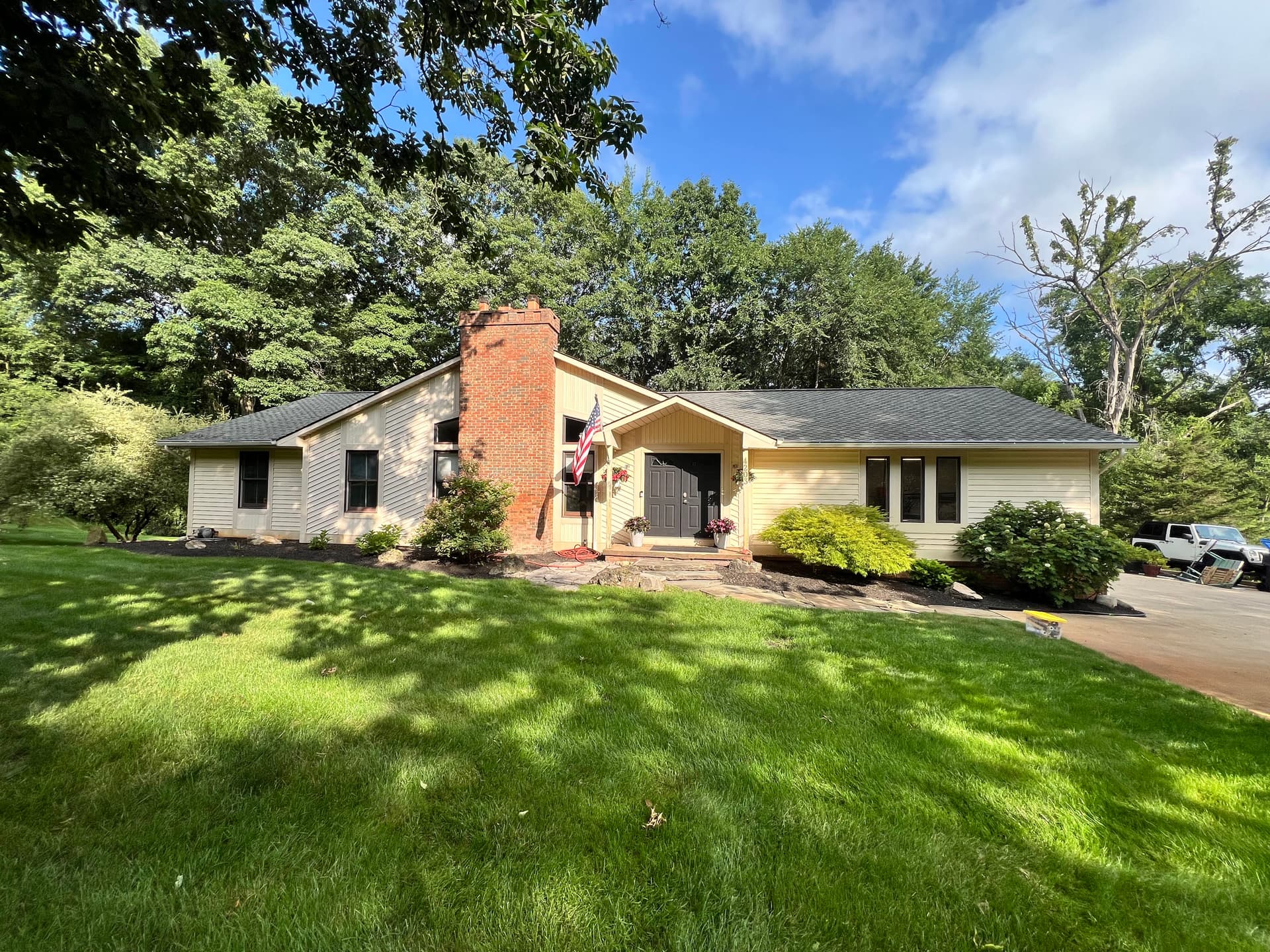
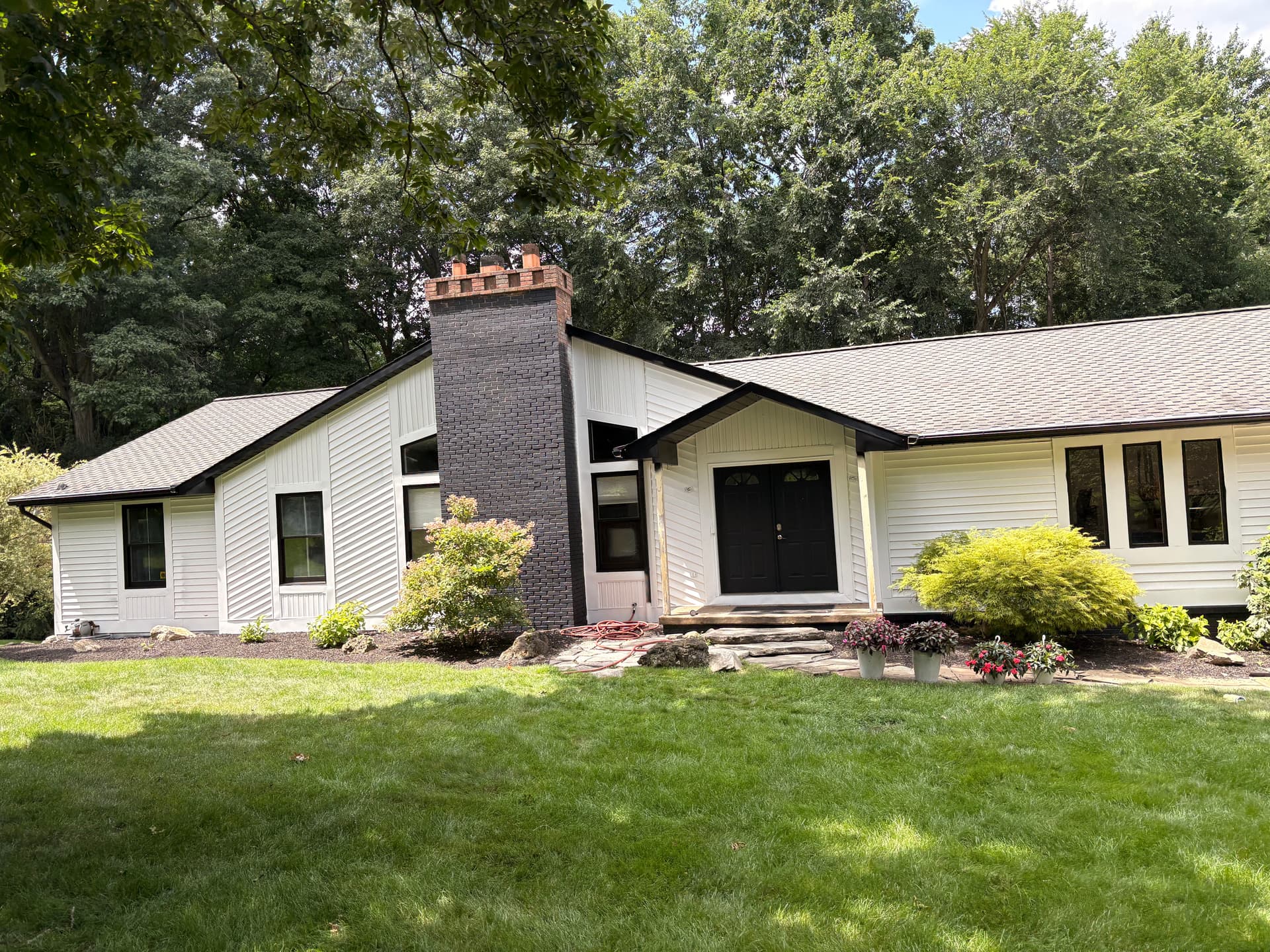
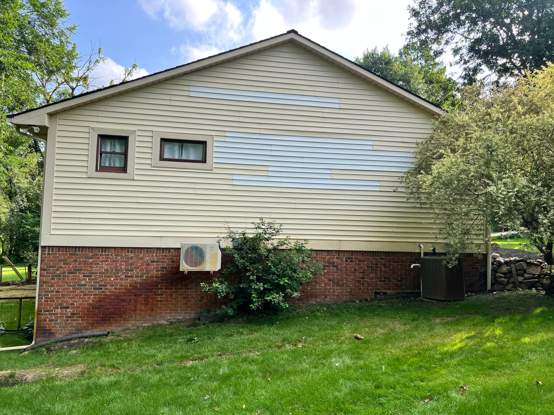
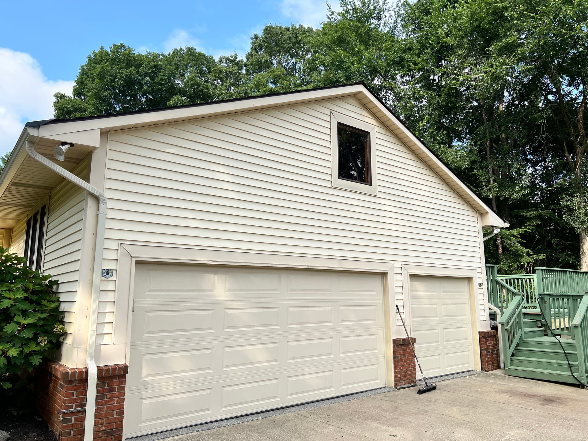
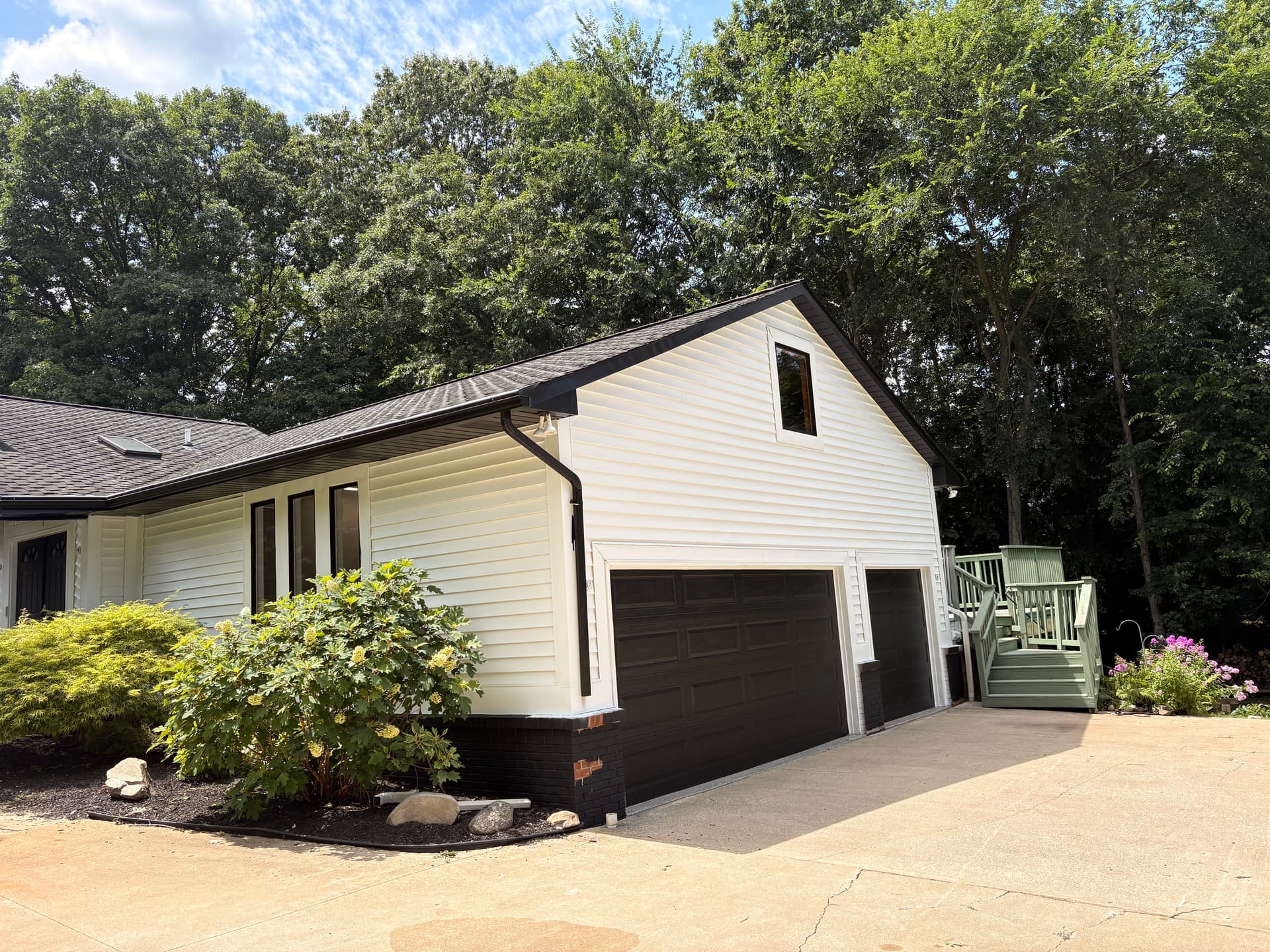
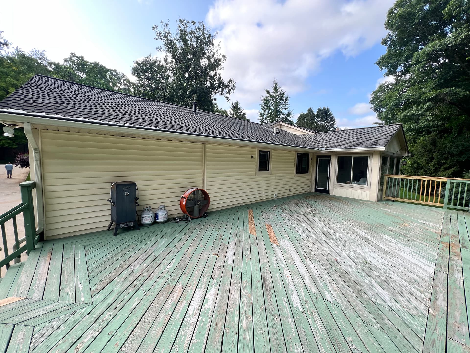
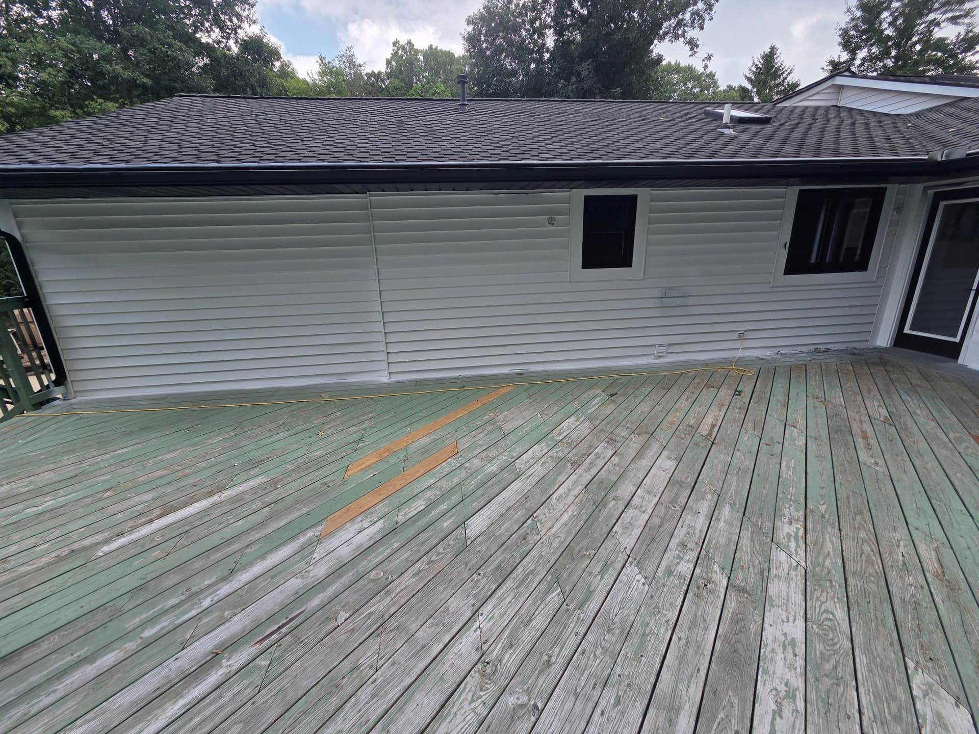
Here's what we were working with - a dated ranch-style home in Howell with yellowed siding, warm-toned brick accents, and a color palette that had just run its course. Good bones, solid structure, but the overall look wasn't doing the property any favors. The homeowners wanted something cleaner. More current. Something with a little more visual punch.
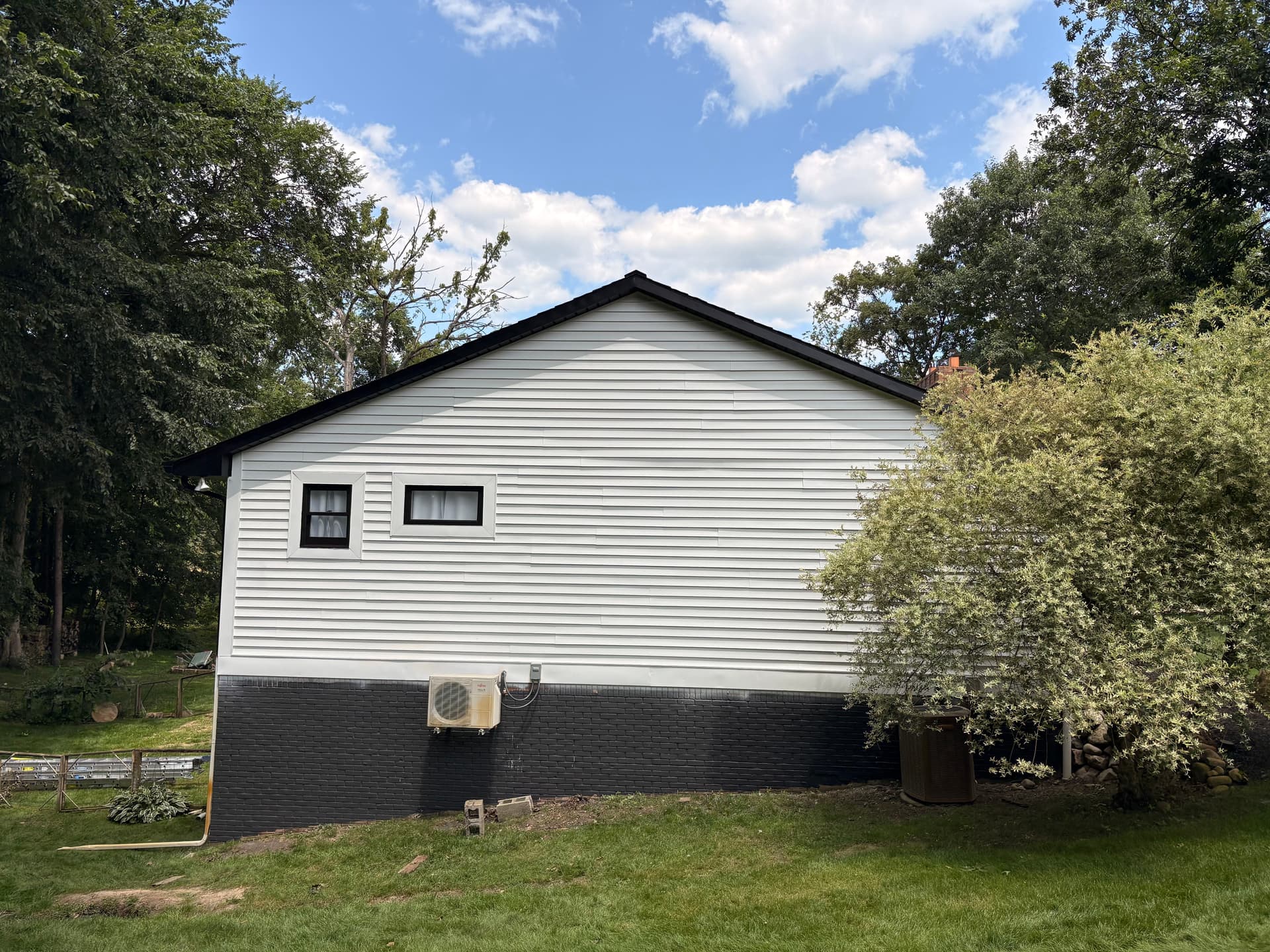
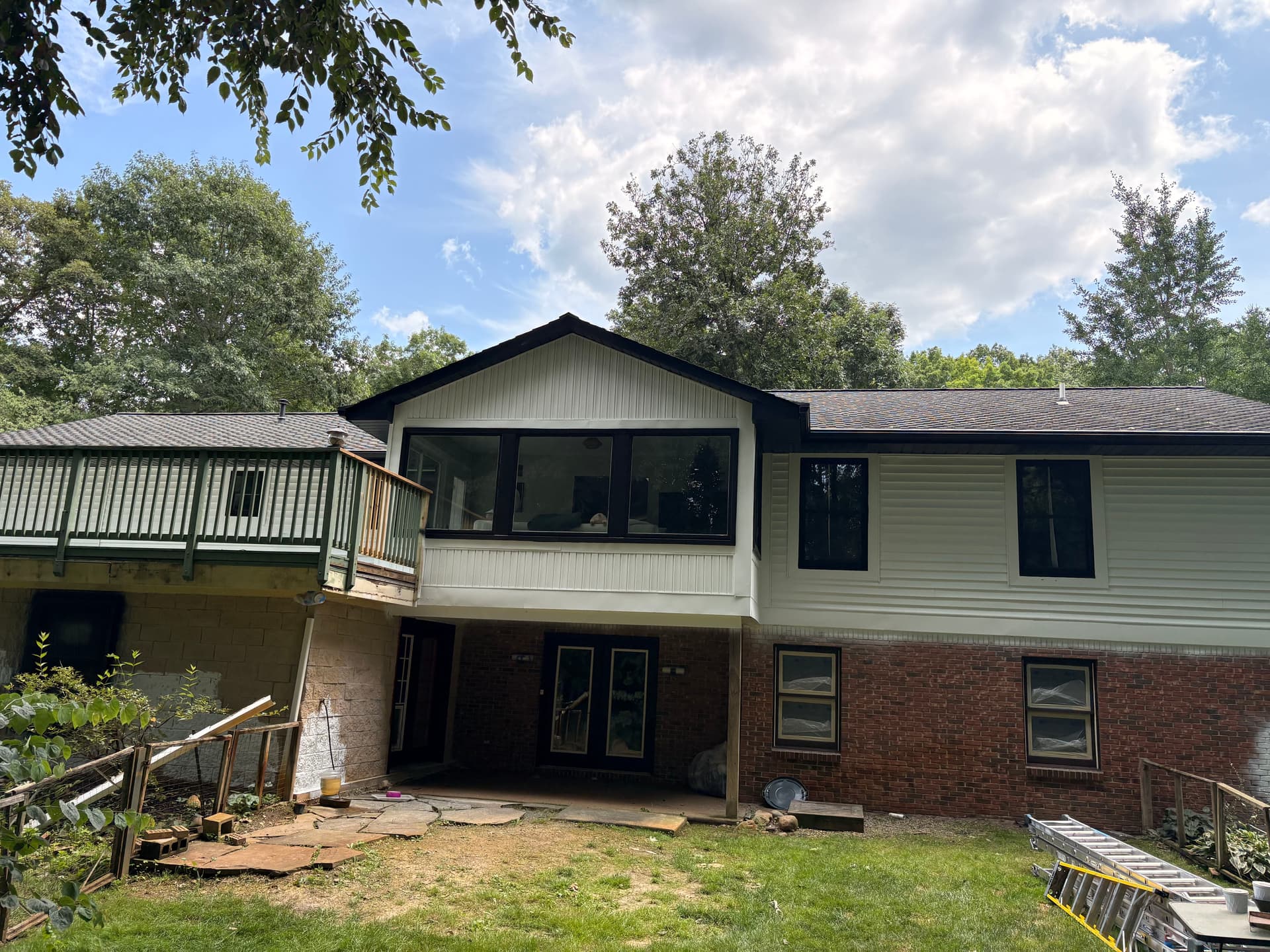
The direction they landed on was crisp white siding paired with bold black on the brick. It sounds simple, but the execution is where it gets interesting. Getting that kind of contrast right means clean lines at every transition - where the brick meets the siding, where the fascia meets the roofline, where the trim wraps around each window. One sloppy edge kills the whole look.
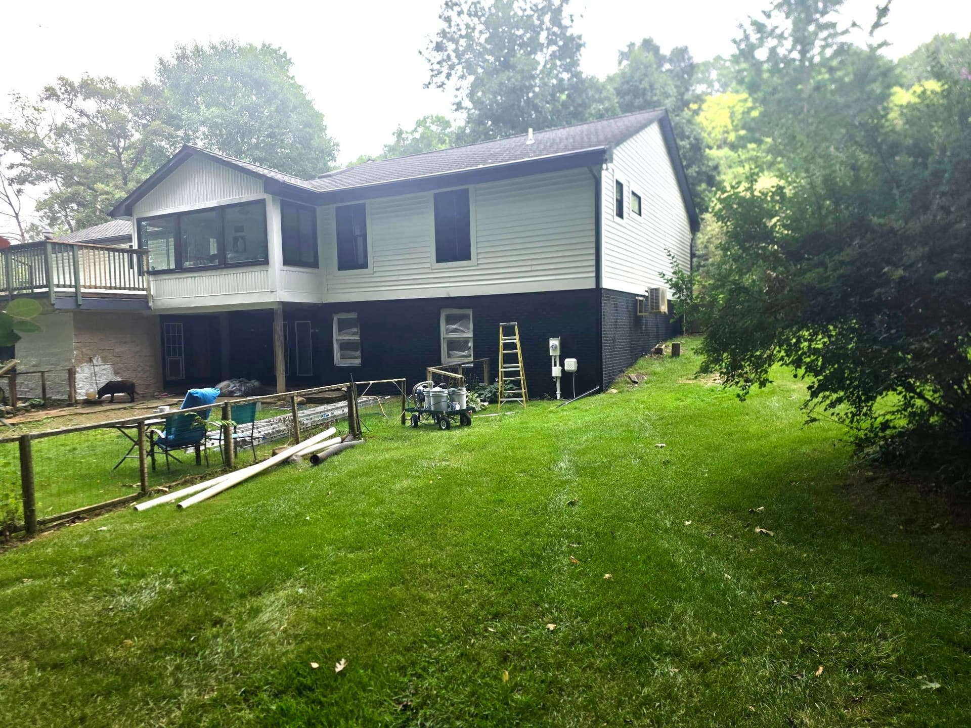
What's really happening with a color scheme like this is a two-tone strategy that architects and designers have been leaning on for years. The white reads fresh and open. The black grounds the foundation and makes the structure feel intentional. Together, they shift a house that felt tired into something that reads as a deliberate design choice. Even mid-project, the difference is obvious.
We tackled the full exterior - front, back, sides, and the garage section - all getting the same treatment. Every surface was addressed consistently so nothing looks like an afterthought. A repaint job done right is one where you can't tell where the work started and stopped.
This one isn't fully wrapped up yet, but the direction is clear. When a color scheme is this well-matched to the architecture, the final result tends to speak for itself.