Bold Color Choices That Make Property Common Areas Pop
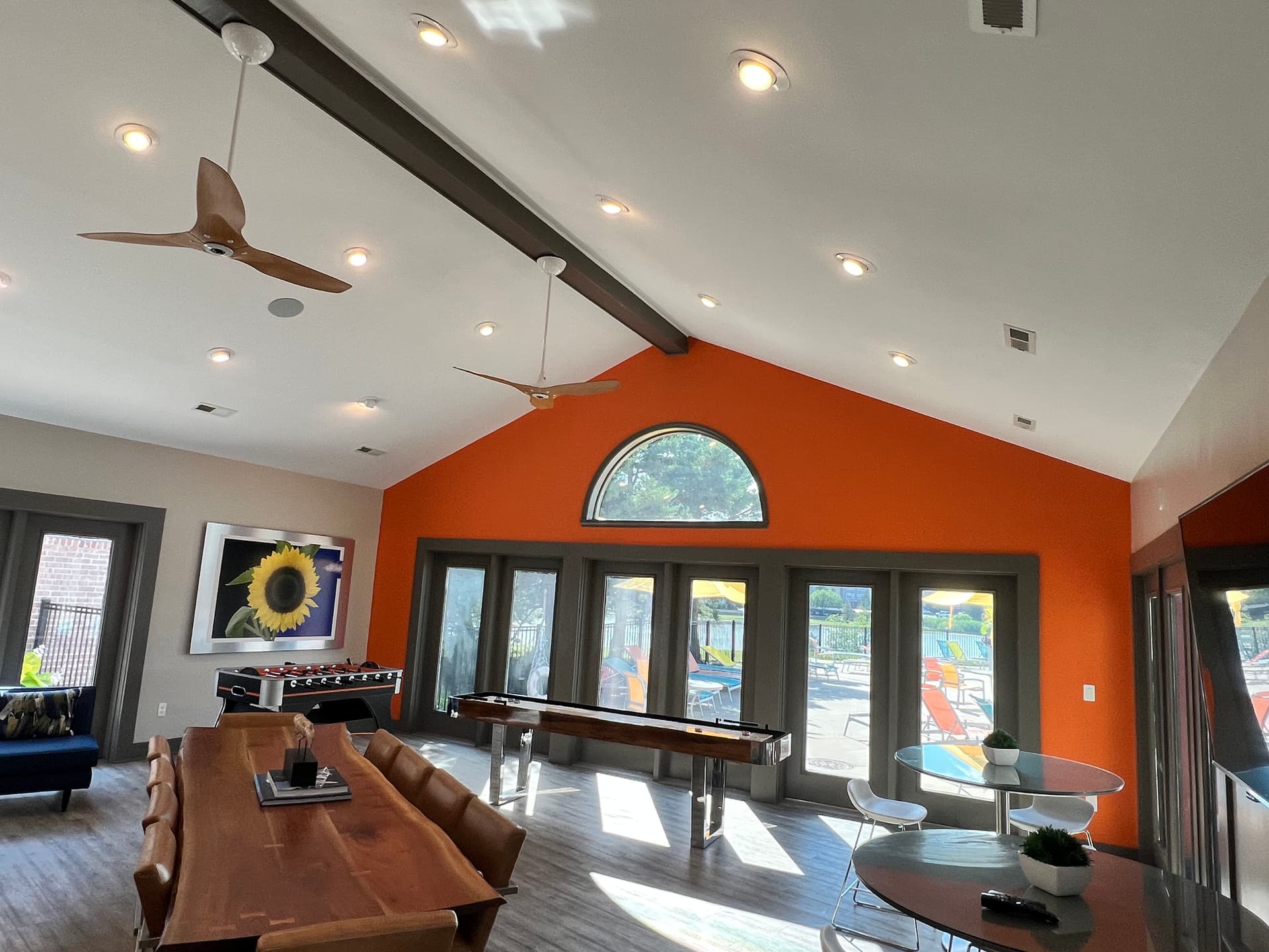
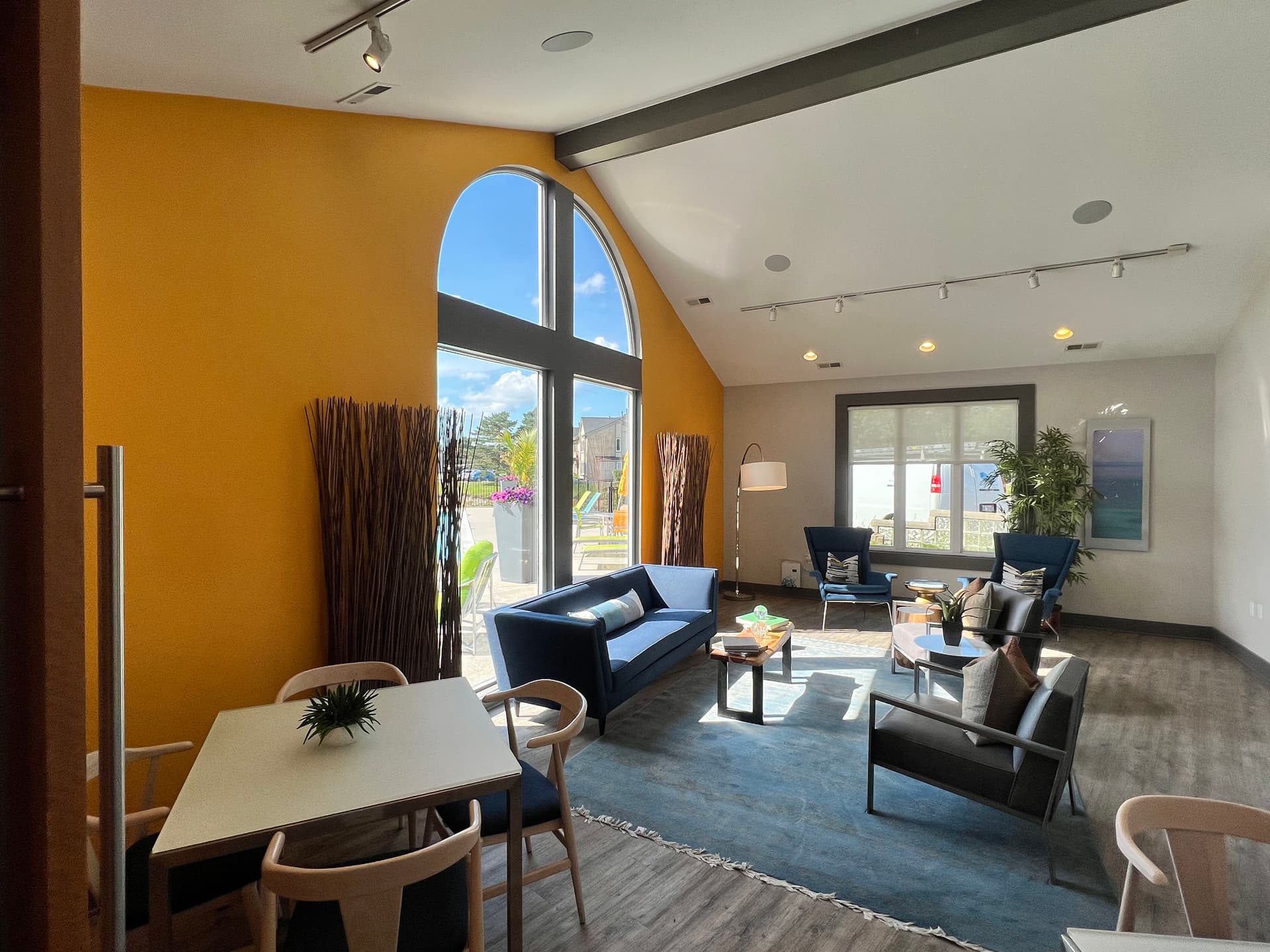
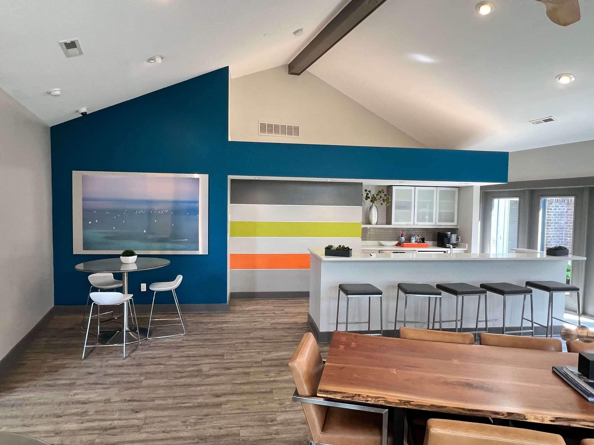
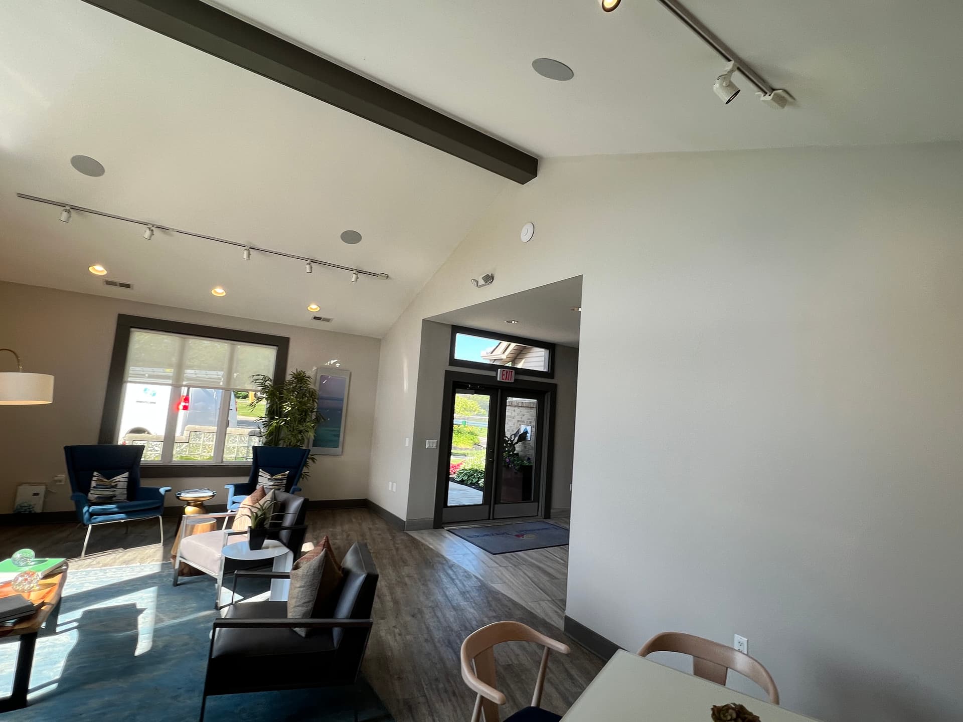
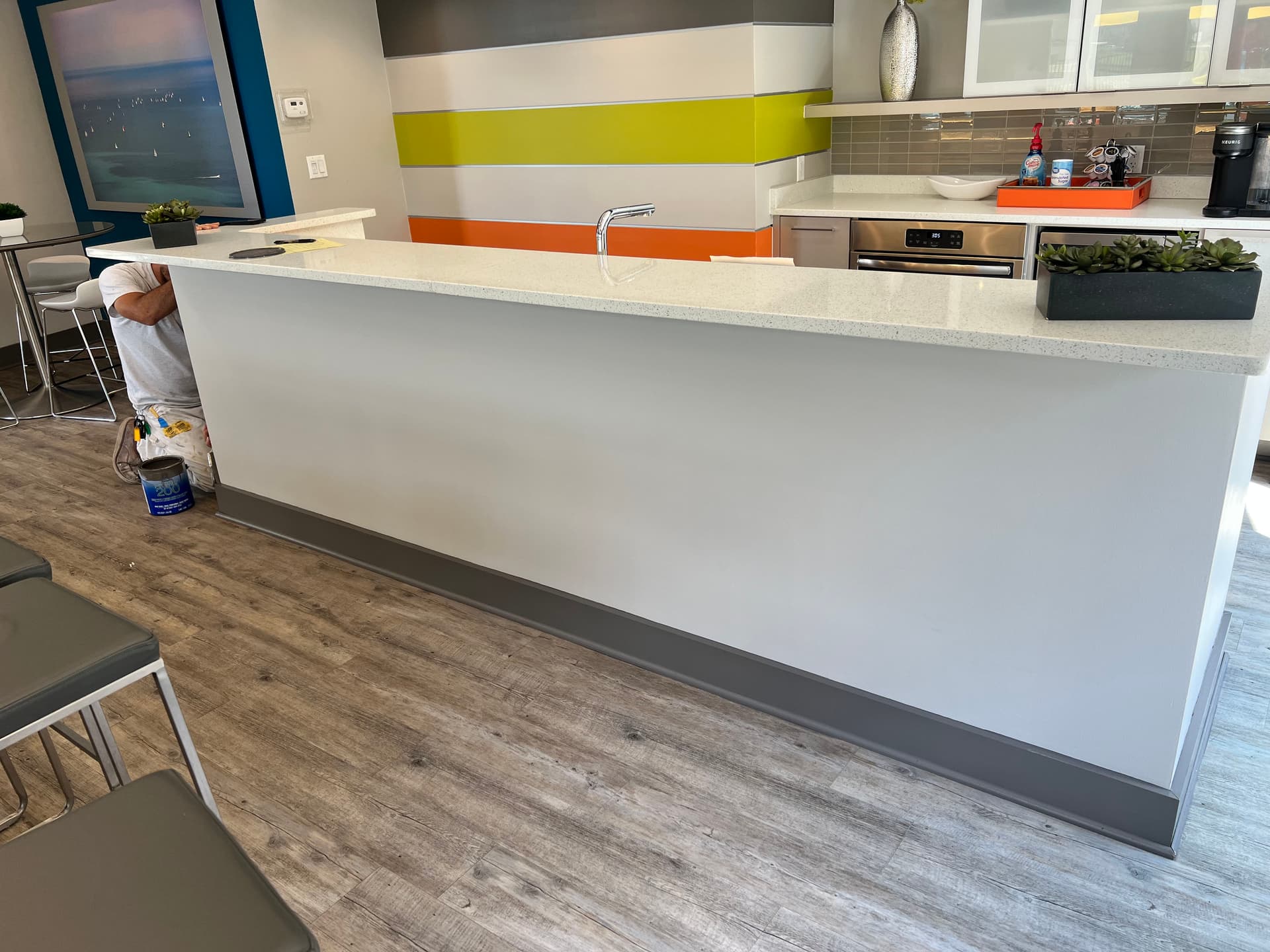
Common areas are the first thing residents and guests see when they walk through the door. If the paint is dull, scuffed, or just plain forgettable - it sets the wrong tone for the entire property. That first impression matters more than most property managers realize.
This is the kind of work we genuinely enjoy doing. Helping a property feel sharp and well-maintained through intentional color choices is a different animal than standard interior painting. It takes a real eye for what works in a shared space - colors that feel energetic without being overwhelming, and neutral zones that let the accent walls breathe.
The color palette here is doing a lot of heavy lifting. A warm orange accent wall in the game lounge, a rich golden yellow in the lobby, a deep teal blue anchoring the kitchen area - each room has its own personality, but they all feel like part of the same community. That kind of cohesion doesn't happen by accident. It comes from solid color consultation up front, before a single drop of paint hits the wall.
We also handle the detail work that tends to get overlooked - clean lines where accent colors meet neutral walls, tight cuts along trim and baseboards, and consistent coverage on every surface. The goal is always a finish that looks intentional and holds up to daily foot traffic.
Property managers trust us because we understand what's at stake. A well-painted common area isn't just cosmetic. It signals to residents that the property is cared for, and that pride carries through to how they treat the space. That's a return worth investing in.